Graphic Pieces
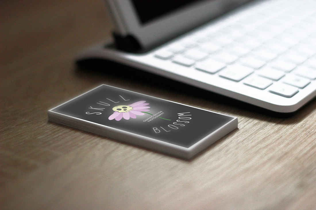
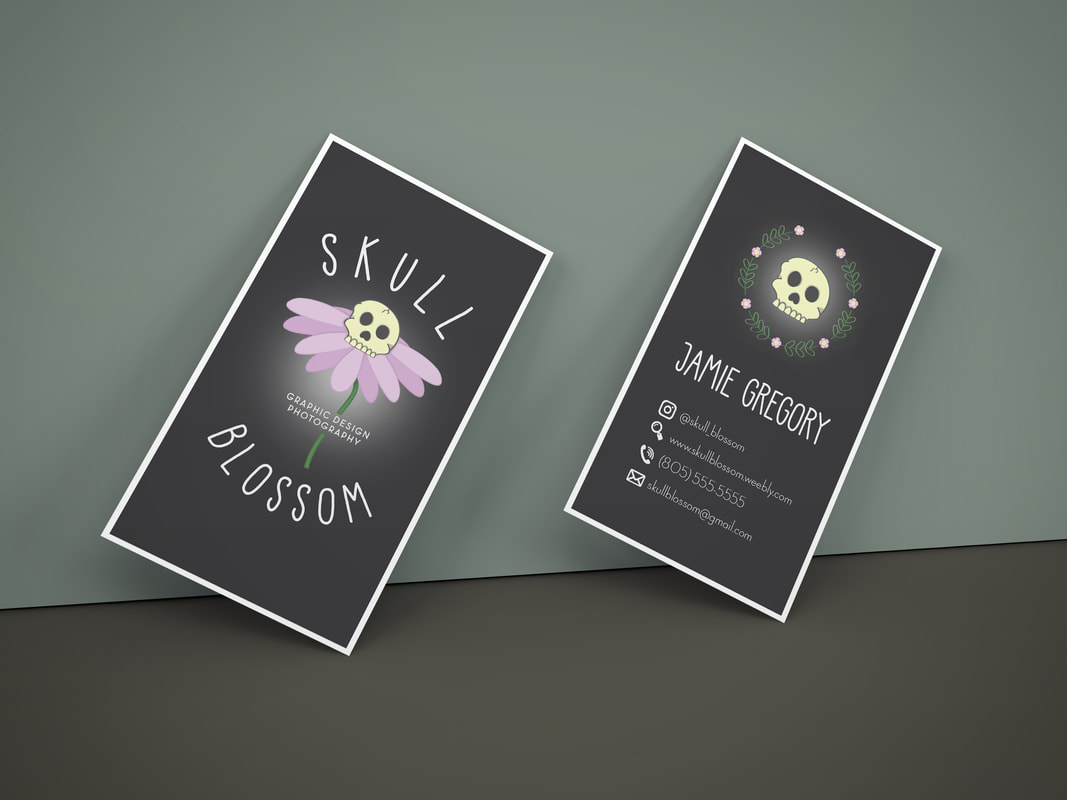
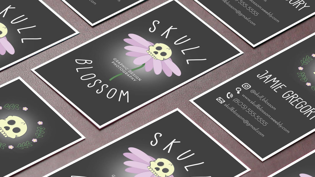
This feel that this was one of my best pieces I've ever produced. I created my own business card and my own brand. I close the name Skull Blossom because I just thought the two words contrasted so much that they actually complemented each other. The logo I illustrated was all unique and original. This is one of the projects I'm most proud and confident of.
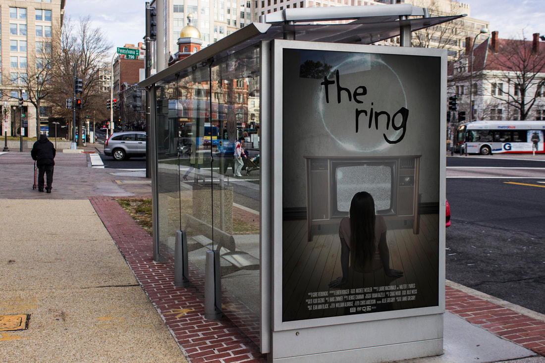
This piece was about the movie "The Ring". This piece was successful because of the glow on the model's hair, the shadows, and the vignette. While working of this piece I learned how to effectively Photoshop shadows, how to use different actions, and how to layout a movie themed poster.
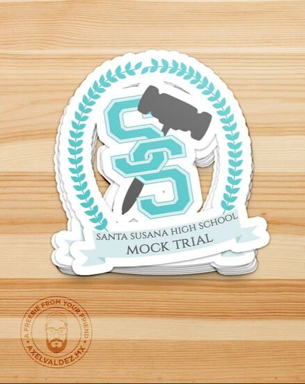
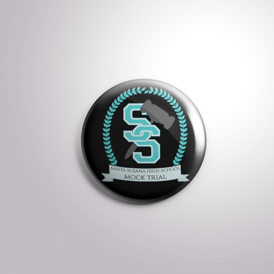
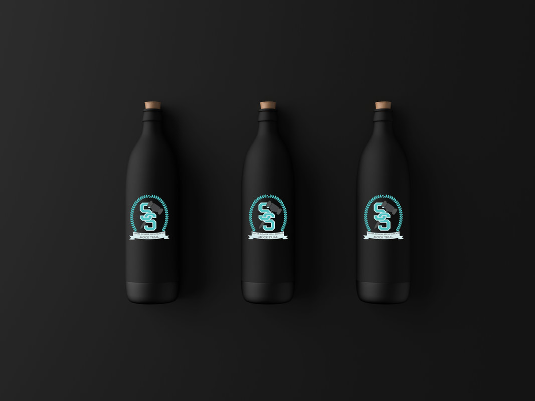
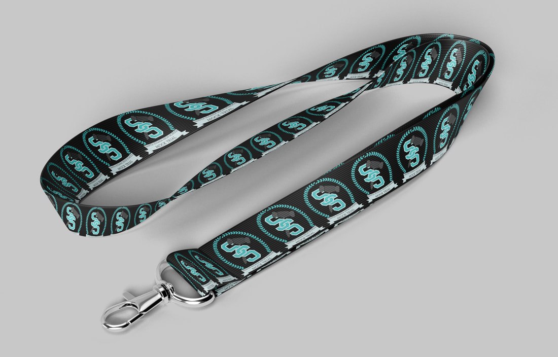
I made the Mock Trial logo for my high school. I communicated with the student in charge of this group. We emailed back and forth a lot. I would send him some sketches and he would give me feedback once he communicated with the rest of the group. We came to this final product. The group ended up putting my logo with the last name of the members on wind breakers. I wasn't aware that they were going to do this. The student I've been emailing came into my graphics class and showed me the jacket he was wearing. I was so surprised! This will forever be one of the best memories that I'll have from my high school experience.
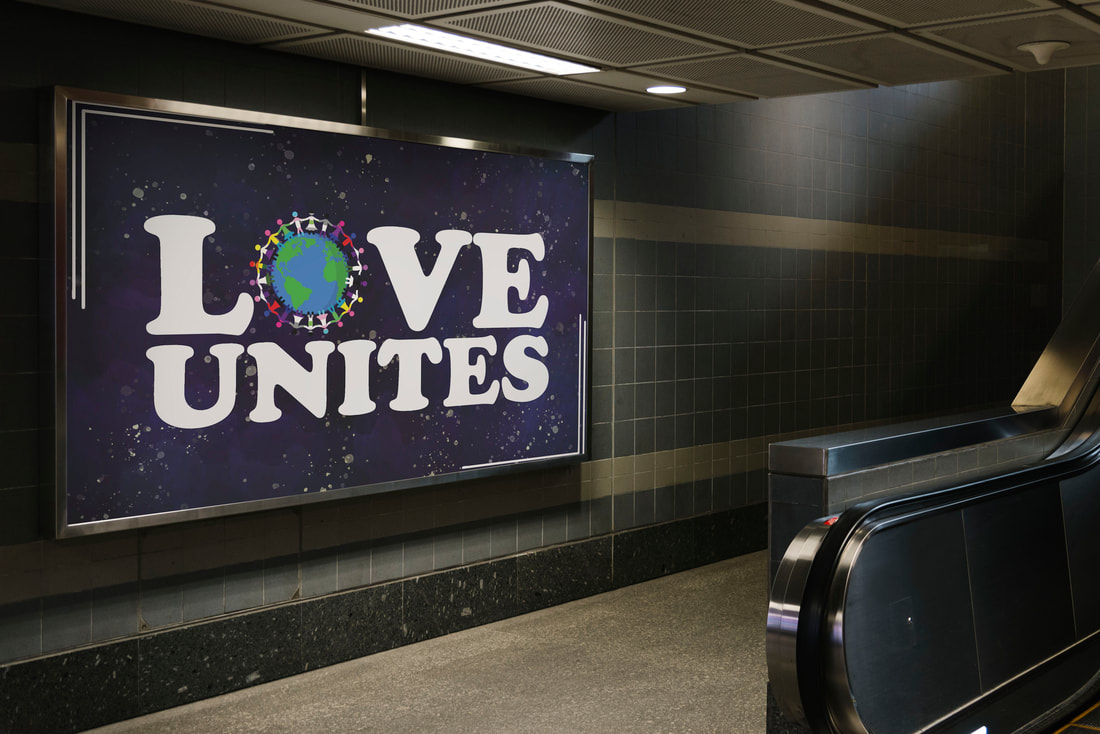
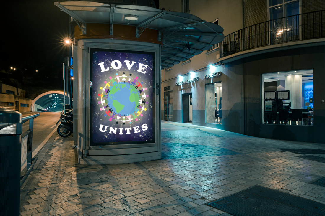
This was a more advanced project I worked on. The goal was to create a poster that is used to support a cause. The cause I chose was LGBTQ+ Rights. I think my poster clearly explains the cause is a visual, concise way. I particularly think the space background really ties the piece together making it stand out.
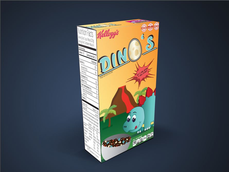
This goal of this project was to make a cereal box. I decided to make a children's brand called DINO'S. I created a stegosaurus character in a prehistoric world. I think I created a fun array of colors that are eye catching and a character that is so adorable that it appeals to kids.
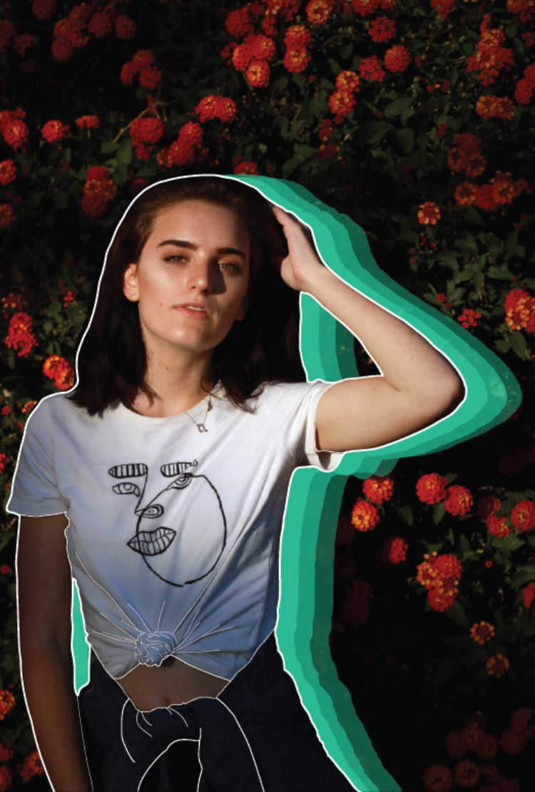
I created these pieces when I was trying to come up with a look for a project inside of school. I found this style was a fun combonations of pop art mixed with illustration ontop of a photo (both are photos taken by other students at my high school).
|
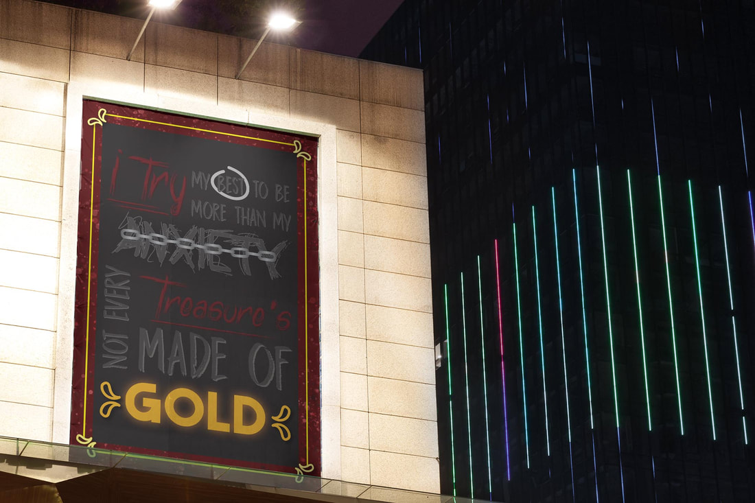
This was a similar piece to my other typography poster. This poster, however, uses more graphic design elements such as the chain, the circle around the word "best", the gold frame line, and the accents around the word "gold". This quote was also a song lyric from the song Laps Around a Picture Frame by Broadside.
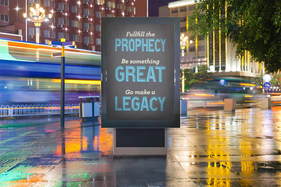
This poster was inspires by the song High Hopes by Panic! at the Disco. My task was to create a typography poster only using words to convey the message and implement more typographic styles rather than illustration images.
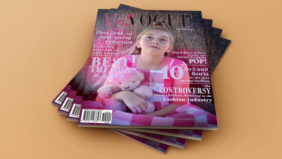
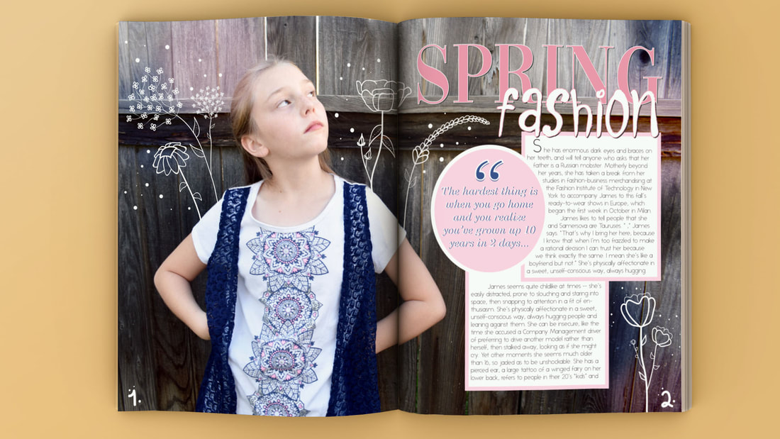
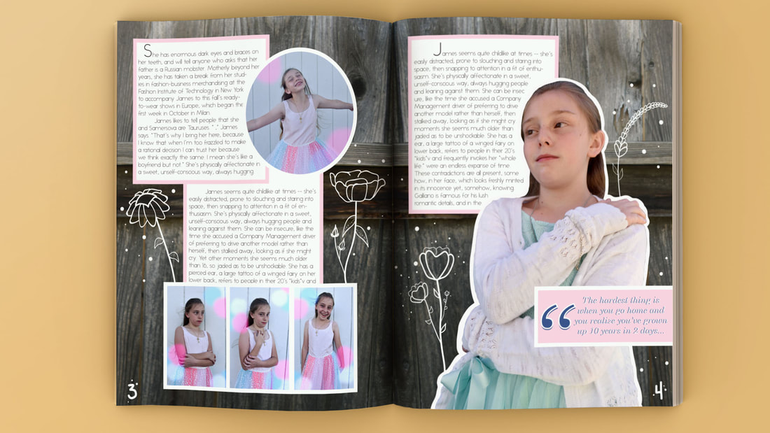
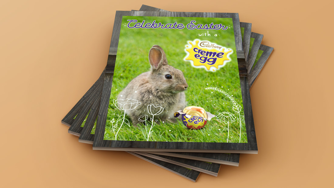
I created my own magazine themed and inspired by a spring issue of Vogue magazine. I wanted to make a magazine that would be interesting to kids and not all about images, more focused around the idea that being a kid is fun and I wanted to portray that with my magazine. I created a cover, 2 spreads, and an ad. I featured the Cadbury Creme Egg as my ad because it's an ad that would appeal to kids and it fits my spring theme.
I created this character for a 15 second animation. Her name is Robin and I wasn't able to import the video. The video was essentially her putting a cassette into a boombox, playing the music, and bobbing her head to the music.

This piece was about choosing a character to make them into a box character. I chose Louise Belcher from the TV show Bob's Burgers. I think this was a successful piece because I made the face really accurate and I created her bunny ears and pig tails. I learned how to create a 3D character in Illustrator, cut it out, and fold it.

This piece was a photo shoot for Fall Out Boy. I think this piece was successful because of the background, the model's pose, the album covers on the bottom right, the Fall Out Boy logo, and the shadows. I learned how to create my own background and create shadows.
|
